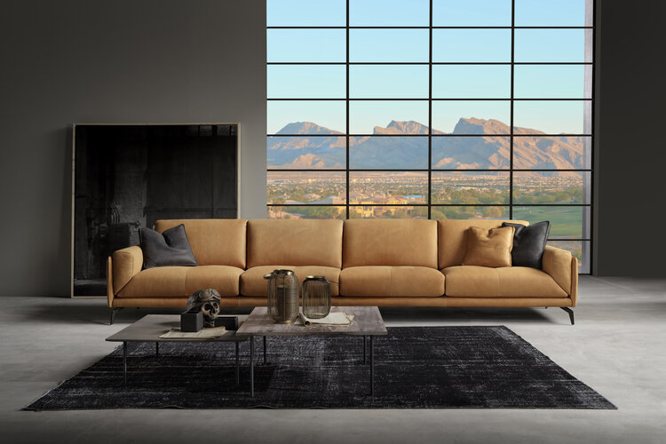
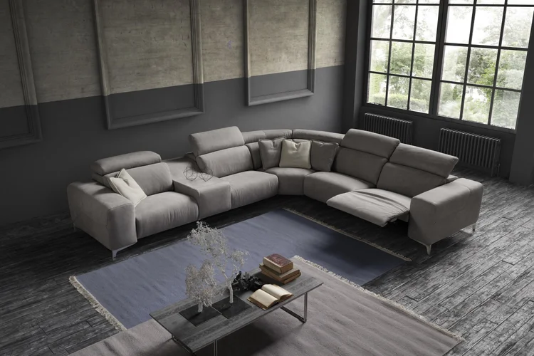
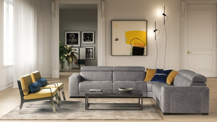
When it comes to interior design, Liz says “let your imagination lead the way and never be afraid of color.” As a rule Liz prefers not to work with muted or tertiary colors as with many luxury home designers today, but instead has looked towards color and vivid whites and blacks to create a visually stunning, and exiting living space.
LIVING AREAS AEW THE BEST OLACE TO START
The family room, living room, and kitchen are the rooms we spend the most time in. Choose a color scheme for those areas first, then pull one color from the scheme and tone it up or down, like taking a red sofa and tone it down to burgundy as an accent in more private spaces such as the den, office or bedroom.

NO SUBSTITUTE FOR A COLOR WHEEL
Colors that are next to each other on the color wheel, such as blue and green — are more casual and relaxing, and work best in informal or private spaces. This is a great way to create a restful and appealing space such as a bedroom or den.

REMEMBER THE 60-30-10 RULE
"When I decorate a space, I divide the colors into components of 60 percent of a dominant color (walls), 30 percent of a secondary color (upholstery) and 10 percent of an accent color (accessories)," says Liz. This ratio ensures that the colors are properly balanced and there's just enough pop for interest.
CHOOSE A COLOR PALETTE
Liz likes to select a color palate and then use as a base-line throughout the home. This will not only help the rooms feel cohesive, but it also helps with the visual transitions between rooms. For example, when standing in the homes foyer you'll often see many of the adjacent rooms as well. By staying in the color palate you'll be able to use variations of the same color and repeat in different ways in each space. Combine that with a vibrant upholstery color, decorative lighting or accessory and the effect is striking.
GRAYS TEND TO STAY
There are many ways of taking today's trendy neutral and gray colors and making them work in any style interior. Gray's chameleon-like quality allows the color to appear either warm or cool depending on your accents. They go beautifully with vivid colors and even pastels to add visual texture and areas of interest to any room.

BASIC BLACK
Liz likes to sometimes add a bit of black in a room which helps clarify the rest of the room's colors, such as black lampshade or a black vase.
TIMELESS PAIRING
“I consider black and white to be the dynamic duo” says Liz, “they never go out of style”. She'll take the dynamic duo and accent it with metallic gold, silver, yellow or red to create a compelling color story.
WORK FROM FROM DARK TO LIGHT
One rule Liz will often follow to make any space look good is by using darker color values for the floor, medium color values for the walls and light values for the ceiling. The idea is that it reflects the natural color of the outside world. In other words the color is generally darker below our feet and grows lighter skyward.
CHOOSE A COLOR SCHEME
If you've selected a patterned upholstery, a colorful rug or a large piece of artwork, choose a color you like from the pattern and use it as a wall color on one or more walls. For a neutral wall paint color, look to the pattern's whites and beige's. The result will look stunning and professional.

FOLLOW THE RULE OF THREE
Keeping your palette to three basic colors is a can't-miss strategy in any space. Take shades of sunny yellow, navy blue and grass green for example and it will make the room feel fresh and vibrant.
This site is being monitored by one or more third-party monitoring software(s) and may capture information about your visit that will help us improve the quality of our service. You may opt-out from the data that https://dashboard-datatracker.com is collecting on your visit through a universal consumer options page located at https://dashboard-datatracker.com/Unsub/unsub.html