The most frequently asked question I receive from clients that are getting ready to move into a new home or about to start a redecorating project on an existing home is almost always the same, “where do I start”? Admit-tingly, its a challenging process for even the most experienced interior designers, and for those without experience in design it can be down-right daunting. Whether it be a new client or a new designer, my advise is always the same, start with the basics and work from there!
These basic decorating principles are simple enough that most anyone can apply them. No matter your budget, your home will be presentable.
Every room has a focal point which recognized as its most emphasized or prominent feature. It's the space that your eyes are naturally drawn to when you walk into the room. The goal is to compliment everything around the focal point. The focal point could be a large window, a spacious high wall or a prominently placed fireplace. If your room doesn't have a built-in focal point, here are some ideas for creating one:
Once you find the focal point 'Frame It', which means decorating around it and using its main color elements throughout the rest of the room.
If a fireplace is your focal point, you can frame it by adding decor on or above the mantle. If your focal point is a large window with a view, try arranging your furniture to frame it. If it's a large mirror or an interesting piece of artwork, you might frame it with two smaller elements on either side. Once you have a focal point (or anchor) you can now balance the rest of the room.
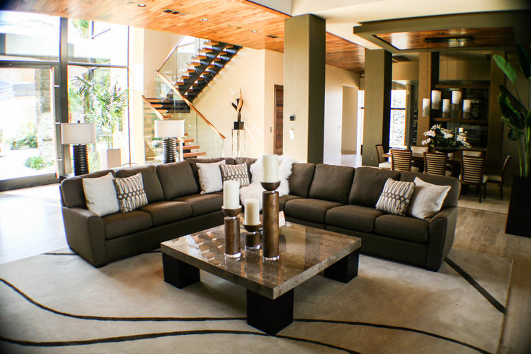
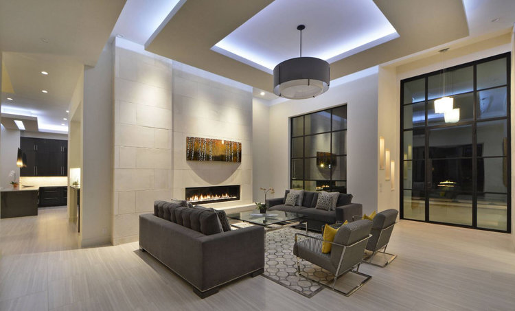
In the example below, I chose to make the cocktail table the focal point of this beautiful room.
When arranging furniture or hanging curtains most people just employ the oldest tool in the toolbox, the 'human eyeball'. But actually there are specific measurements that interior designers employ for decorating that make a room look better. Get your tape measure and keep this mind:
The image below is an example of 'front on' as well as the proper distance of the sofa from the TV and the cocktail table.
We have all heard the old adage about 'sometimes less is more'. In modern contemporary homes, this rule is especially true. In this case the negative space is the area that's not taken up by any subject, such as the white area on your walls. Its tempting to fill every space with a subject, but sometimes, the negative space speaks for itself.
Decorating with negative space can be a bit tricky, but there are a few ways anyone can do it:
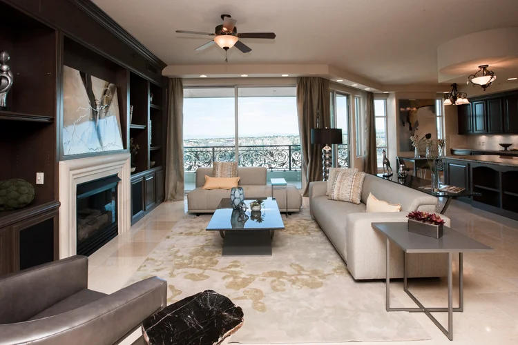
Employing negative space is not just about looking for places where you can remove things, it's about looking for spots that look great even when they're empty. The image below is an excellant example of the use of negitive space.
If your a photographer, than you already familiar with the rule of thirds, for its an essential part of framing a photograph or subject. In photography the rule of thirds means that 'the subject isn't centered in the image, which is how many new photographers frame their shots. Instead, the main focal point is a bit off to one side. Using the rule of thirds draws the viewer's eye into the composition, instead of just glancing at the center'. In interior design, using odd numbers as a foundation is a way of creating harmony and visual interest.
For example, it helps to have groupings of objects in varying heights, shapes and textures, while at the same time maintaining something similar about them. This advice seems to contradict itself, but the point is, there should be something that groups your items together, but also something about each of them that is slightly different.
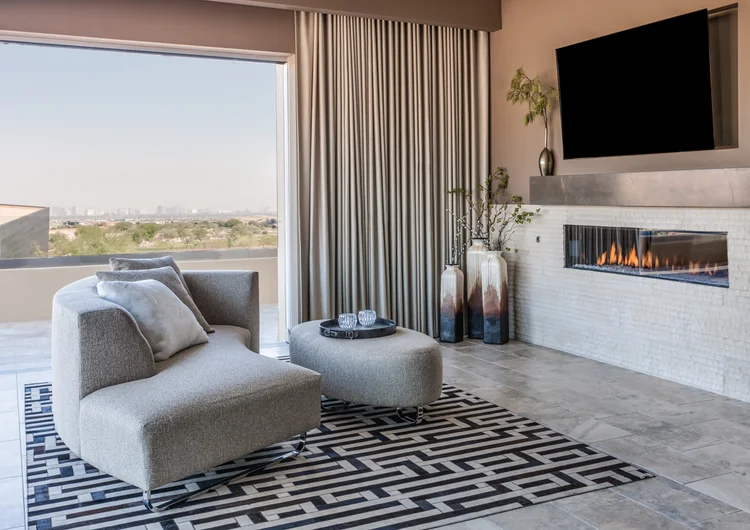
In the image below you will see an example of the rule of thirds in the selection of the vase's in the corner. It also a great example of what we discussed earlier regarding the use of larger curtians to create the illusion of a larger window.
I have written entire posts about the proper use of light. It's a vital and integral part of interior design and should not be taken lightly. But for this post I'll keep it brief by listing just the basics.
Below we see all lighting examples employed in one room.
Start in one room, follow these basics, then move on to the next. By doing so you'll make your home look like your own, one that highlights your style, tastes and preferences. My first and foremost suggestion is to take your time and not rush the creative process. Once your satisified with one room and it feels right, then move on to the next. In the end you'll have a home that looks as if it was decorated by a professional.
This site is being monitored by one or more third-party monitoring software(s) and may capture information about your visit that will help us improve the quality of our service. You may opt-out from the data that https://dashboard-datatracker.com is collecting on your visit through a universal consumer options page located at https://dashboard-datatracker.com/Unsub/unsub.html